Typemaster
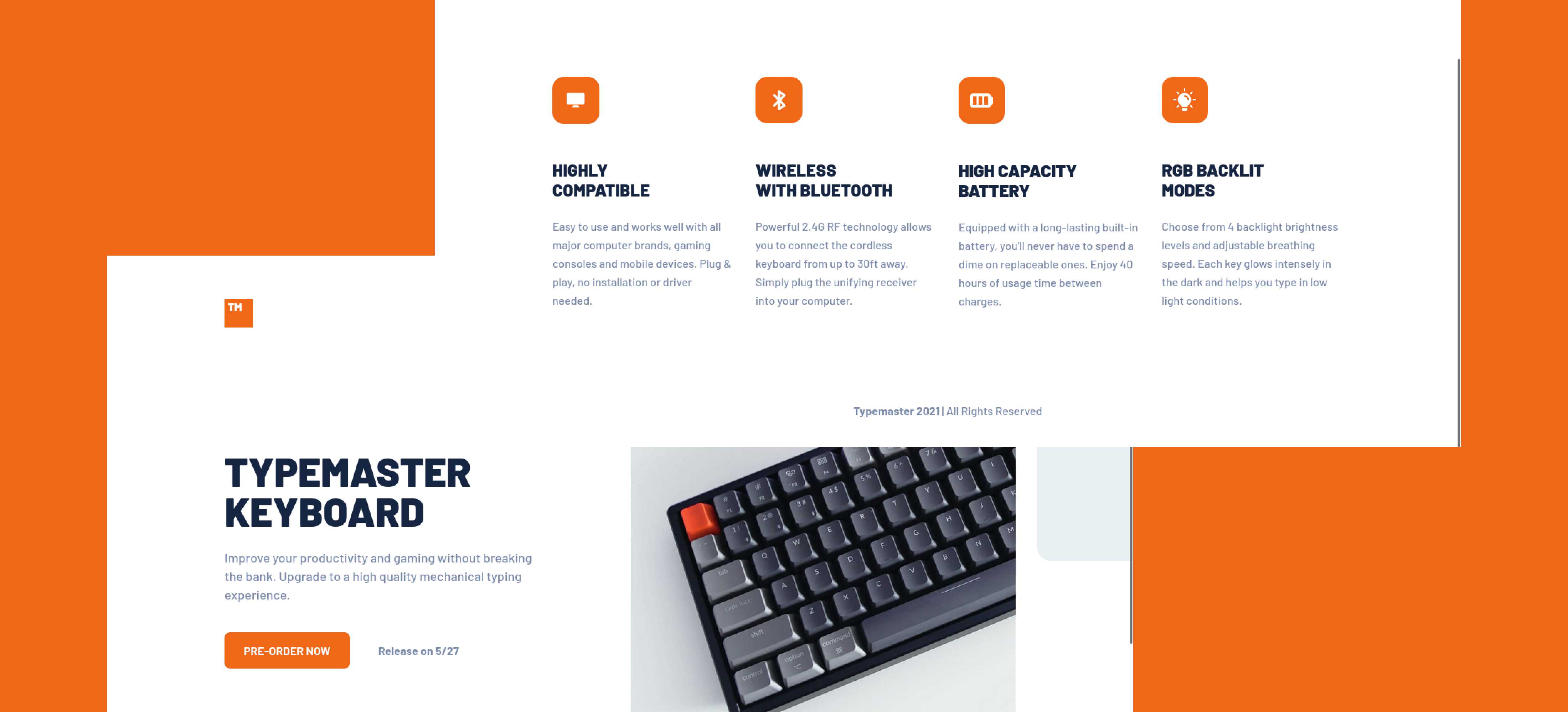
A beautiful product landing page built with HTML and SCSS along with modern CSS practices.
Problem and thought process
At first, I was planning to build the layout with only CSS Grid as suggested in the challenge details. But I only used that for the last section with the four logos.
I was also struggling with overflow:hidden that didn't work, I still am, that's why I styled the first keyboard image a bit differently.
There is one picture with an orange overlay I didn't get it to work like the original design. I wanted to give up trying after a few times, because opacity didn't work out as the effect I want, and setting the background-color's alpha channel didn't work as well. Later, I decided to take a look at the code snippet section we have in Figma. I saw a mix-blend-mode property was used and I tried that out and I think the color looks much prettier with this property.
About the responsiveness of this challenge, I believe there must be a better way of doing it, my way is more of a brute-force style. I used absolute positioning for the images and set different breakpoints to have different sizes.
Useful resources
- Why does position absolute make page to overflow? - This helped me for understanding why overflow does not work as we expected.
- When importing a file with @use then: Error Undefined Mixin - This is the exact question that I asked on Google as I received the same error message when I couldn't get to use the mixins that I have defined in
_mixins.scss. Therefore, I have to import like so:@use 'mixins as *.